This is my final two magazine front covers i am going to give a short explanation to why i chose them as my final ones.

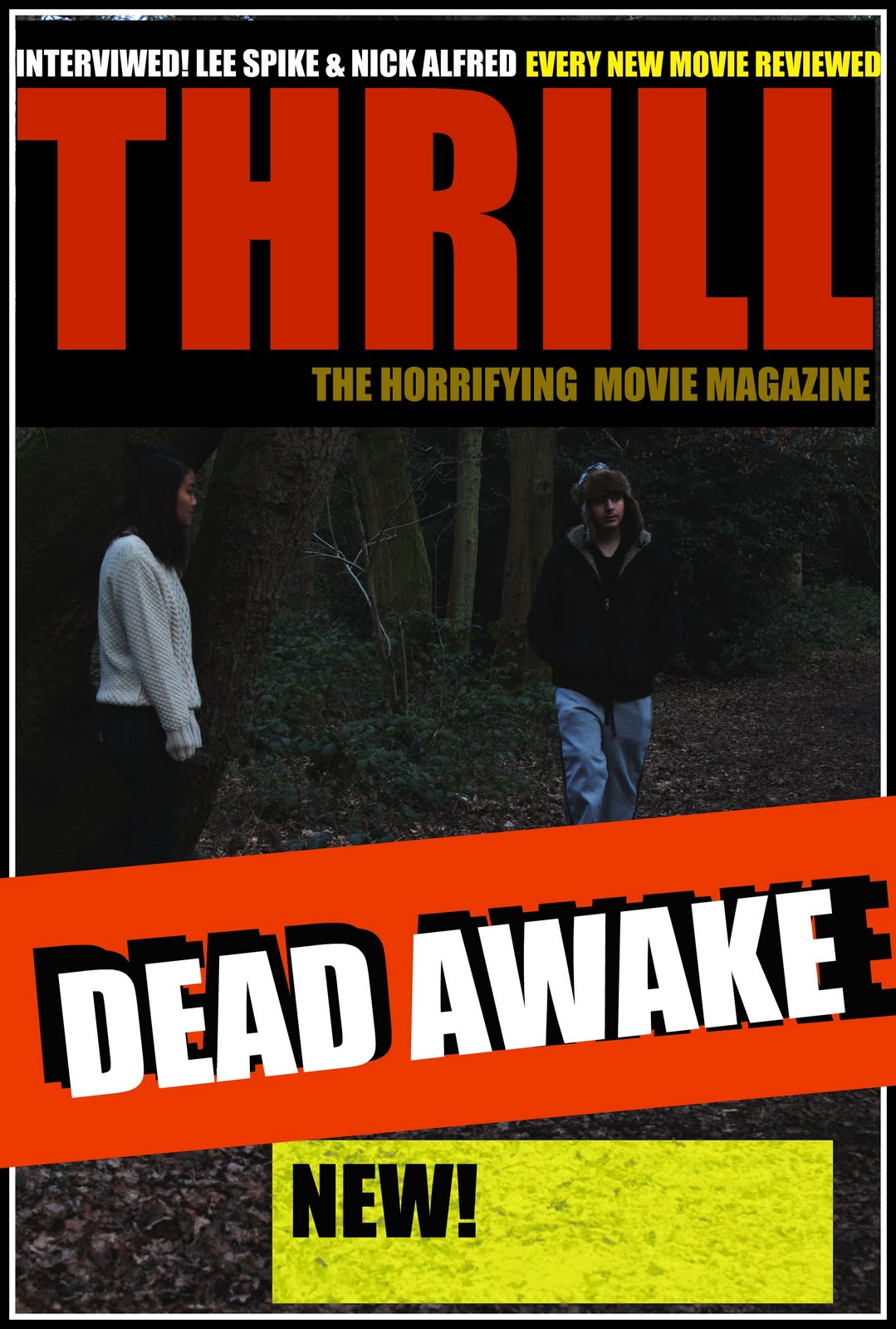
I think having this front cover challenges the convention of magazines, because almost all magazine that i researched did not seem to have a image zoomed in so it is just the thing in the whole front page. however, my magazine also develops the magazine convention by having the bold writing, only one font used and having two or at most three colour combination used and most importantly as found in my research of magazine that all the image are shown to be looking at the audience so they have more focus and gets more attention.

This is my other magazine front cover, for this I have stick with real magazine convention of having shown more rather than zoomed in, i have added bar code which all magazine have and a extra image in the page, however by having the other image small, the most attenuation is given to the main image and the masthead. As for langauge I used exclamation marks so that it gives the audience more friendly-ness, and excites the audiences.
No comments:
Post a Comment