Pages

Wednesday, 13 April 2011

Poster

Here are the drafts of my posters.


final poster

This was my final poster. I have used the convention of having a scary writing in the poster, also the lines match up with my final ending page of my trailer. I have used different instution, production names and I also used whats todays popular interact site -'facebook' therefore, I will have more audiences. For new convention I used three images rather than having a big image this pattern of three i thought works well on the convention of horror genre. I have challenged a new convention of having a girl as a killer and a male victim, setting the plurisim theroy.


list of shot


For my final action, I recorded all the different shots i used to produce my trailer.


shooting schedule

After my storyboard I decided to write down all the information props and date so that i will be organised in my time and use it efficiently.


storyboards

Before making the trailer I am going to create a storyboard for my trailer so that i will have more focus when filming the trailer and making it.


Trailer - Draft


M Night Shyamalan

M. Night Shyamalan (born Manoj Nelliyattu Shyamalan) is one of the few blockbuster directors who lean in the direction of horror/suspense. Although his films often feature supernatural and otherworldly phenomena, they generally are not considered horror movies -- in part because they're relatively family-friendly affairs, focusing on plot and interpersonal relationships rather than explicit content. This clean, "classy" style of fright filmmaking has drawn comparisons to legendary director Alfred Hitchcock -- a parallel aided by Shyamalan's propensity for twisty storylines and cameo appearances in his own movies.

The Sixth Sense:

After his financially disastrous feature film debut, the comedy-dramaWide Awake, Shyamalan made his first foray into horror/suspense with 1999's The Sixth Sense. The modestly budgeted film about a child psychologist (Bruce Willis) treating a boy (Haley Joel Osment) who claims to see ghosts exceeded all expectations, becoming the second-highest-grossing film of the year (after The Phantom Menace) and garnering six Academy Award nominations, including Best Director.

The Sixth Sense established Shyamalan not only as a master of suspense, but also as a blockbuster filmmaker. It established his style of dramatic, personalized thrills, shaped by both his direction and his writing. Perhaps most notably, though, it established his slight-of-hand storytelling, which culminated in one of the most infamous "twist endings" in cinematic history. The twists would continue through Shyamalan's next few movies, becoming a trademark that would characterize his early career.

Unbreakable:

It's inevitable that a follow-up to a smash like The Sixth Sense would disappoint, both critically and financially, and Unbreakable (2000) had that unfortunate distinction. The film again starred Bruce Willis, this time as a man who discovers that he has superhuman abilities: tremendous strength, extrasensory perception and "unbreakable" bones. He ends up using these gifts to become a superhero of sorts, catching a serial killer in the process.

Like The Sixth Sense, Unbreakable portrayed the human side of supernatural occurrences, while also delivering suspense and a twist ending. Despite Shyamalan's fear of being pigeonholed as a "scary movie" director, the studio marketed Unbreakable as a spooky film in the vein of The Sixth Sense. The tactic didn't parlay the film into the runaway success that The Sixth Sense enjoyed, but Unbreakable still managed to gross almost $100 million domestically at the box office, more than enough to ensure the director's A-list status.

Signs:

Shyamalan struck gold in 2002 with his next movie, Signs. Featuring the star power of Mel Gibson, it found immediate success, raking in over $200 million at the US box office. The film explores the phenomenon of crop circles from the point of view of a rural Pennsylvania family who finds that their farm is ground zero for an alien invasion.

The aliens in are decidedly more ominous than those in, say Close Encounters of the Third Kind, as Shyamalan plays the invasion with a horror sensibility, delivering scares without the modern crutch of gore. Although the film's reception was largely positive, some fans and critics began to tire of the director's twist endings, which by now threatened to become career-defining gimmicks.

The Village:

Criticism mounted for his follow-up, 2004's The Village, whose twist ending turned off many vocal critics and fans. The movie as a whole failed to garner the critical praise of Signs, and many viewers felt that it was a misfire. The film's setting was much different from Shyamalan's previous efforts, taking place in a 19th-century township in which the villagers live in fear of creatures who occupy the surrounding woods.

In the writer-director's typical fashion, the film focuses more on the human dynamics between the characters than on the supernatural element of the "creatures." Despite the criticism it garnered, though, The Village managed to earn over $100 million in the US, the third time in four tries that Shyamalan had reached that mark.


Shyamalans style is something i wish to re-create in my trailer, this will be done by using what i have drawn from his audio and visual examples.


Textual Analysis - poster Covers


like I did for my magazine front covers , I am now going to do the same for the movie poster:


final two magazine covers


This is my final two magazine front covers i am going to give a short explanation to why i chose them as my final ones.


I think having this front cover challenges the convention of magazines, because almost all magazine that i researched did not seem to have a image zoomed in so it is just the thing in the whole front page. however, my magazine also develops the magazine convention by having the bold writing, only one font used and having two or at most three colour combination used and most importantly as found in my research of magazine that all the image are shown to be looking at the audience so they have more focus and gets more attention.


This is my other magazine front cover, for this I have stick with real magazine convention of having shown more rather than zoomed in, i have added bar code which all magazine have and a extra image in the page, however by having the other image small, the most attenuation is given to the main image and the masthead. As for langauge I used exclamation marks so that it gives the audience more friendly-ness, and excites the audiences.


Evaluation 4

What have you learned from your audience feedback?


  • music was scary...


    didn't understand the production names , has good zoomed in lips but didn't like it having coming up too much. actors should have had more emotions showned. and lastly did not really like the smile at the end.


    other than that good gob.


  • Nice music , like the trailer but the video colour is dark...:D


  • definitely would like to see this as a movie.


  • Good music


  • Scaryyy, hope she dont come back to get ME.


    Above is my audience feedback, taken after i uploaded it on 'Youtube' what i have learned is i should be careful chosing the new convention


Evaluation 2

How did you use new media technologies in the construction and research, planning and evaluation stages?


Picnik.com
Used this for my final draft of magazine and poster
The writing


Blogger
It is the most important part in my project, I learnt how to upoald, file, pictures and videos into the blog. I also found it easier than having a project done in a writen paper which may get lost. however this helped me keep all my files safe and mostly organised. It took a big part in evulation stage as it was easier to type it in blogger rathen than written by hand or in microsoft word.


Adobe Photoshop Elements
This also plays an important part in my prject mostly for my construction of poster and my magazine. It helped me by having burn tool, so that i could make my images darker and it also helped me layer the images as i wanted.


Camcorder
This was used for my trailer, This was very useful as it had a nite mode and also it was light so it was easier to carry around. It also heped me zoom in and out at times.


Micromedia Flash 8
I used this to create my own creation of production company logos for the opening of my trailer. In my opinion it was the most difficult to use in-terms of technologies. I learnt how to create a movement in certain pictures or still images.


Adobe premiere Elements
This was used for my making of trailer, i.e editing and joining different scenes making a full trailer. This helped me change the different colour for my trailer as i wanted a black and white and blue-ish (tint) effect on my trailer as an new convention in media industry. This also helped me add different effects change the contrast, saturate the image. most importantly because i did not want any sound in mine it helped me remove all the sound and add different sound effects as I wanted.

Camera (SLR) canon ds500

As i am a photography student aswell, I found it easier to take a still photograph for my poster and my Magazine which was done using this camera. I could change the setting manually so if i wanted a darker image i could do it by changing the 'iso' setting form my camera.


Windows movie maker
This was used to make my first try out draft of my trailer. it helped me montage clips and create a trailer. However, after in my opinion Adobe Primire was much more detailed and had more options then the movie maker.

Evaluation 3

How effective is the combination of your main product and ancillary texts?

As mentioned earlier in my evaluation; the use of the ancillary texts showing more depth and locations to the original insular trailer, gives the film a larger sense of depth, and supports the usage of a minimalistic set in the trailer, this helps to expand the film.

One area i would go back and change would be the usage of colour in my posters (ancillary), as they contradict the style of my trailer (Main), this i believe is a flaw in the combination of the two products.

My completed Trailer - Dead Awake

http://www.youtube.com/watch?v=_CeE-7tK7xo This is the link to my final completed trailer.


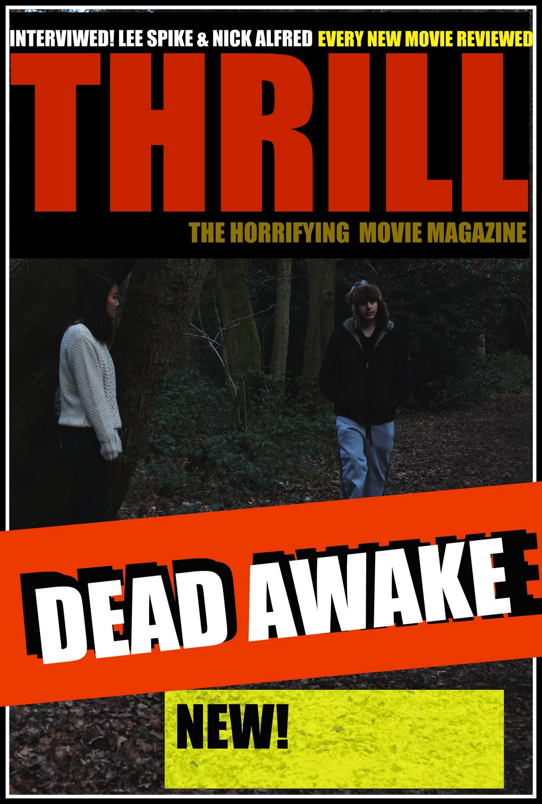
Here is the draft of my trailer that i did before creating my actual trailer. I wanted to try different ideas as possible.

Evaluation 1

In what ways does your media product use, develop or challenge forms and conventions of real media products? (I.e. of trailers)

The title of the film

The title of my movie 'Dead Awake' was chosen because it adheres to a stereotypical genre specific, an uninformed audience would be aware of the genre without seeing any other media information on the film i.e. still shots, trailers, posters. This then adheres to the convention of real media products, when an audience member hears the title 'Haunting in Conneticut' or 'Paranormal Activity' they are aesthetised enough to know that these names will be assosciated with a certain genre i.e. Horror, as apposed the title 'Cinderella' which would be assosciated with a different genre all together. I feel the use of the Juxtaposition in the title of 'Dead' and 'Awake' does develop this convention however, as the nature of the contrast evokes a form of curiousness to the title, but still within the realms of the horror genre; the closest assosciation being that of the 'zombie' otherwise known as the 'living dead' but other assosciations could be that of a medical situation.

Setting/location

The main setting for my trailer was the street and driveway of a house, i chose limited set as i was concentrating on trying to make the trailer insular, this idea was drawn from trailers such as 'Devil', the actual movie would not be as limited and i believe this is clear. I was only showing one instance of the story, so it felt more like a 'documentary' a tool used in the trailer for the movie 'signs'. In the posters i made sure to use images from different locations to show that the movie was not as insular as it appeared in the trailer.

Costumes and props

I used posters reading 'I'm Back', i placed these all down the street in my trailer. Other than that i kept the costumes the same in the posters and in the trailer this is done to keep convention and continuation, this was worked in my filming schedule.

Camerawork and editing

I used a variety of different camera angles and attempted to film it as if the camera was following the protagonist. This style adheres to the current convention of media style in this genre, the 'hand held' camerawork has been used in many media outlets from this genre from the 'blairwitch project' to 'paranormal activity' and 'rec' however i developed this convention by not making the camera be diagetic to the shot, but however an external factor, to give the impression of somebody or something following, but to make that be the audience.

Tuesday, 12 April 2011

Textual Analysis - Posters - The Strangers


Textual Analysis - Posters - The Ring Two


The Girl shown looks lonely and vulnerable, but because her face is not shown, the vulnerability is subverted and instead the image instils mystery and dread. It does not show who it really appeals to, by doing this it appeals to a wider prospective audience, however the low key colours and general horror themes align this poster in the horror genre, especially with the subversion of the 'vulnerable' girl, a theme associated with many horror films. The use of small letters instead of large promotional capital letters gives the impression of the writing of a child and the only capital, the 'O' links to the main theme of the movie; a ring. We know it is a teaser poster because it does not have a specific date or release info on it, this is installed to cause intrigue and realism; by not allowing it to cohere to usual cinematic promotional poster rules, i.e. cast promotion, company promotion and release date info, makes the poster seem removed from the film genre and more 'real' more like a warning. The image looks like it has been recorded through a low res camera or television screen this coheres to a darker less polished horror genre.

To attract aud

Textual Analysis - Magazine Covers


As Part of My project i shall design a magazine cover for my movie, to do this i shall invest in some primary research on other magazines which provide promotional images for movies. for this research I looked upon different movie magazine in the market and one of the top being Empire Magazine. Here are the 3 Empire magazine with different months issue, I am going to write down the similarities and differences in the magazine so that i can use it when making my own.


Similarities :


  • bar code at the bottom

  • The main image - eyes looking at you- grabs more readers attention.

  • Masthead big and bold, not always same font but has the same colour.

  • at most three colour combination been use


Differences :


  • Different effects and fonts in masthead - depending on type of movie.

  • writing sometimes covered - because people known its that magazine makes audiences feel more involved.

  • no second image or have just one second image on the page - gives more attention to the main picture.


now I am going to look at another film magazine 'Film' and compare them with 'Empire' and spot out the similarities and differences.


Similarities:

  • Both the magazine have bold front cover

  • Both the magazine have image look straight at you - more attention

  • both have bar code at the bottom of the magazine

  • both seem to have yellow circle which grabs readers eyes.

  • not necessarily have second image.

Difference:


  • 'Film' magazine have movie names mostly bold and in centre of the page, so it is clear for their targeted audiences.

Textual Analysis - Trailers - Kidulthood


The representation of Kidulthood about the lives of several teenagersgrowing up in the deprived areas of West London; the way in which the trailer is represented by this is that we see what kind of environment these kids are brought up in and some of the temptations that surround them.
Due to the portrayal of teenagers within this film, it seems that a lot of people who watch this trailer may be able to develop their own opinions of what they think teenagers in today's society are like based on the language in which they speak. There seems to be a lot of "ghetto" language used within the trailer, Kidulthood is filled with a lot of modern slang which greatly characterizes today's youth. The target audience for this film is mainly aimed at people aged between 15-24, the film itself attempts to represent a serious number of issues of what some teenagers growing up in today's society have to go through; this explains why so many people who are in this age group may watch it. There is also a very realistic approach within this film as most of the actors and actresses are within this age group and therefore know what others their age go through. The mood of the film is set within the trailer based on the music played. Throughout the trailer, the music is very upbeat which keeps the audience engaged and focused, added to the music are sound effects which also keep the audience engaged as it not only shows the level of violence within the film but also a view into what the film is about and what kind of film it is.

A variety of shots are used within the trailer; close up camera shots are used to provide a dramatic emphasis, highlighting characters' expressions which gives a sense into what will happen within the film based on their emotions and how they are feeling. Long range shots have been used to show viewers the environment and surroundings of which the characters are brought up in In a way, Kidulthood is able to educate those who watch it as it gives the audience an understanding into what people who live this lifestyle have to go through on a daily basis. The audience gets an inside look into how peer pressure can affect teenagers and how some can be persuaded into living a dangerous lifestyle; this is represented by the crimes they commit and the things they get up to. By viewing the trailer, the overall message that it is able to give the audience is that you should not be a follower or maybe even a leader but that you should choose your own path into how you wish to live your life.

Textual Analysis - Trailers - Devil


In this trailer, there is a fair representation of both male and female and of nationality and different range of ages this is exentuated by the clothing of the characters as they are clearly defined to their own archetypal roles; business women in a suit tight suit old lady in dress and flannel cardigan. The audience are also aware that this is taking place in an office as the environment is clearly defined in some opening establishing shots...

These establishing shots show a city, in a traditional pan-landscape view but sub-verses the usual by flipping this upside down and showing text placed within the city dimensions (between office blocks) establishing the mood. This flip contradicts the text being shown "on any ordinary day" this flip effect distinguishes this as not an "ordinary day" as something extra-ordinary is going to happen, this is aligned with the suggestive imagery of a flipped city. Within this city the focus is upon the office blocks, and the business that is done within them, this gives the ideal of the archetypal 'ordinary day' the daily grind of work, and the almost clockwork mechanism of the fluidity of a working city, this all aims to set up the biggest contradiction to the extra-ordinary happening.

The use of the word Devil and the Hispanic man trading Catholicism's denotes that this movies audience is not just one of the thriller genre but that of the religious satanic, the questioning of the purity of religion has been rife in 21st century cinema, including such films as The Da Vinci Code etc.

The main bulk of the trailer suggests that the film will be focused upon a single location (An elevator) the use of the mirrored walls in the trailer help to give the film more depth as with other movies with singular locations (Phone booth) there needs to be as many depth effects as possible so as not to give the audience member a claustrophobic effect, this is helped by cut scenes to other locations in the trailer.

Textual Analysis - Trailers - Black Swan


The first thing we're introduced to is a black room with a spotlight of a dancer just off the centre of the screen with the voice over stating "I had a dream last night about a girl who was turned into a swan, and her prince falls for the wrong girl, and she kills herself" - That is the story summed up. But we don't particularly notice this, because the close up of feet and intricate moves she makes brings us more focused on the picture than the voice. Now a more threatening pipe song comes into focus bringing a sense of hype to the making of this film. An establishing shot of the ballet room the film places much emphasis on gives us an idea of where the film is based, with lots of very talented dancers practising together in a dark room - Notice the walls and floor are all black. This colour is of key focus to the cinematography. We hear "The only person standing in the way is you" with her reflection not following her, but having a world of it's own - Double personality signifier. The music has this wind like noise matching to the movement of reflection, almost paranormal like. And the screen goes black giving vulnerability. The pace of the music drives the tension of the trailer up until the final 'curtain' as the anguish of the character comes to a dramatic and tense end at the close of the trailer. The use of colouring is key to the effect of this trailer as it dictates the thriller genre and also the lack of hope and happiness, usually signified by colour.

Textual Analysis - Trailers - Signs


The diagetic sound of the wind charm and the dog barking builds tension as the trepedation of something going wrong. The use of the television tells the audience about the background to the film, this is a useful tool as it provides a background to the film without breaking the realism of it (aka with a non diagetic voice over) while showing the television makes it seem like it could exist, this effect is used in several trailers such as 'I Am Legend' and other disaster movies.

The use of music troughout t trailer makes the audience more thrilled and anxious, and instills horror to the surrounding environment, the general fright ofthe 'unknown' is a tool that deeply effects audiences in the horror/thriller genre, look at the most famous examples 'Jaws', 'Paranormal Activity' and 'Cloverfield' do not show the antogonist untill the very end, this build up of the unknown is what drives the essential root of fear.

The target audience for this movie is based for educated audiences, probably a little over the age rating of the film (15) and ABC1 and JICNAR because of the farm and semi-delapidated houe shown in the trailer, the main appeal of this movie is to people who followed the 'Crop circle' incedents and perhaps the 'Nazca Lines'.

The Language used in this 'Its happening' pairs with the realism of the use of realistic set design and use of tv to explain the backstory in the trailer, to almost make it seem disconected from the fictional world and instead in place in our own.

Textual Analysis - Trailers - Vampires Suck


Vampires Suck is a spoof film on the Twilight movies and comes from directors Jason Friedberg and Aaron Seltzer who have been behind many films in the spoof genres, such as the Scary Movie Franchise.

The trailer starts serious with non-diagetic choir music with a long distance shot of a car driving through a forest, alone on a long and winding road, this is filmed in the same colour tone as the twilight films (dark, washed out and pale). Text appears on cut shots to a black screen with smoke billowing in the background interspersed with cut scenes of sunsets and forests, this writing is pale and is again in the theme of the colouring and tone of the previous shots.

The trailer then shifts theme around 30 seconds in, the music changes from choir to upbeat happier music, this is triggered by a pause in the non diagetic music and a diagetic doorbell sound. The text between scenes goes from being white text on a black background to red writing on a white background (a staple of comedy presentation) and the trailer starts to show clearer scene clips with dialogue showing some of the scenes, jokes and obvious comparisons to the Twilight movies. Text Such as 'Bites the big one', 'Bites' is an obvious comparison to the theme of vampires in Twilight and 'Big one' refers to the pop culture position of the movie it is spoofing.

Textual Analysis 5 Trailers Introduction

In the next 5 posts I shall examine 5 Movie Trailers and draw from them styles of film-making, trailer convention and media device s.

The 5 Trailers i shall examine are range of genres so I can identify as many varying techniques as possible, although i have focused somewhat on the thriller genre as their Trailers appeal personally to me.

- Vampires Suck -
- Signs -
- Black Swan -
- Devil -
- Kidulthood -